Responsive Website Design
Responsive Web Design (RWD) allows a single website to be viewed seamlessly on a variety of devices, from smartphones to tablets, to desktop computers. No need for a separate mobile website - with responsive design it allows the same site with the same structure and content to display with the correct layout on the device used to view it. Responsive Design is the future for websites and we can help you build a website for the future.
RWD is the method of designing websites that will respond their layout to the device being used. For example when you are on a Desktop computer you will see the original layout. Then if you view the same website on a tablet or smartphone the website "responds" using media queries and adapts to the device being used.
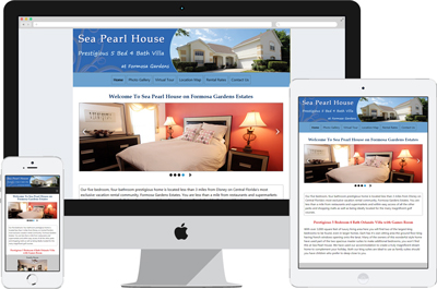
The example below shows a recent website we designed for a villa owner.

The mockup shows the website on a desktop browser and how the website displays on a smartphone. The menu goes from being horizontal across the page to collapse "hamburger" for more room and the text is still readable.
No more "pinch/zoom" or scrolling from left to right to read.
Better still, any photo gallery automatically resizes to fit the screen so on the desktop you can have nice large photos and on the smartphone they will resize relative to the screen size.
All other elements of the website, contact form, availability calendar (if you use ours), google map etc are also responsive.
Our own website (slgweb.co.uk) is responsive - of course! If you view our website on a smartphone you will see that we have the collapsible menu system with show/hide for the user to tap to see the menu and navigate around our website. More screen space for the content.
Why Would I Need A Responsive Website?
There are many articles on the internet that suggests half of all emails are viewed/opened on a mobile device. If you are sending emails regarding your rental property to a potential guest and you include a link to your website in that email and that guest is viewing your email on a mobile device wouldn't it be great if when the potential guest taps on the link they are taken to a website that they can read?
Imagine if they tap your emailed link, then they are taken to a website that has been shrunk down so small that it is unreadable on their phone. What will that guest do? Will they save the email until they are back in front of a desktop computer or move onto the next property? If that next property has a responsive website then that owner may get that booking - not you!
If you already have a website try viewing it on a mobile device. If you do not have a mobile device you can emulate the same thing by resizing your browser width by narrowing the window. If you cannot read/view your website easily then this is what visitors using a mobile device will see. Now try the same thing with this page. You should see our layout reshape to a readable design. The banner at the top of the page resizes and the menu collapses.
Do I need a Mobile Website plus a Responsive Website?
No.
In the past many people had mobile versions of their website created which were hosted on a special mobile URL (e.g. m.yourwebsite.com) and then when visitors would go to www.yourwebsite.com they would be redirected to the mobile site. The mobile site would often be a stripped down version of the main website with limited items on show.
This meant that 2 sites had to be maintained (and paid for) and any changes on one meant changes on the other - more costs.
With Responsive Website Design you only need one website - and one set of costs.
Should there be any content you would rather not show (extra long paragraphs of text or photos) on the mobile version we can code your website accordingly. For example our website has the share/follow buttons (Facebook, Twitter etc) showing on the desktop version but when viewing on a mobile device they are hidden.
I Already Have a Website - Can It Be Updated to be Mobile-Ready & Responsive?
Yes it can.
Depending on your existing design and the code technique used by the original designer most websites can become responsive. Some design elements may have to change slightly and some items (e.g. Flash) may have to go but the benefits of having a responsive website far outweigh any cosmetic changes.
Mobile-Ready Responsive Forms
We also make the contact forms user-friendly when displayed on a mobile phone. Have you ever noticed on a smartphone when you are completing a form and adding your telephone number that only the number keyboard shows? We make sure this happens with our contact forms.
Likewise with the email box the keyboard that displays includes the @ symbol so that your user does not have to tap the "shift" key mid-type.
